Marian Bantjes is a designer, typographer, writer and illustrator. She started out as an art student at Emily Carr College of Art, but Marian dropped out of art school early and decided to train as a typesetter in Canada. It was here that Marian learnt a lot about typography which lead to her career in design. Marian Banjtes work is illustrative which makes it so unique. Her most famous works include ‘Speak-Up’ t-shirt design and the book ‘I wonder’. Marian’s career has three main stages, firstly from 1984–1994 she worked as a book typesetter. In later years Marian worked in and founded a graphic design company from 1994–2003 called Digitopolis. Bantjes has worked by herself as a designer, artist and letterer and it is this latter work for which she has become internationally known.

Life and Career

Marian started out her design career at Emily Carr College of Art, which she dropped out of after her foundation year. Soon after leaving art college, Bantjes was hired to do photocopying and filing at Hartly & Marks/Typeworks, but this soon turned into being trained in layout and paste-up, which led to her being trained as a book typesetter and continued this job for ten years. This job did not involve any design work although Marian learnt a lot about typography during this time, she became very good at it and this shows throughout her design work.

Marian’s job as a typesetter ended badly, with a fight with her boss. It was after this that Banjtes started up her own design company, even though she did not know much about image, layout and colour. Bantjes started her company with her friend Sue and they initially named it ‘Communications by Design’, which they changed five years later to ‘Digitopolis’. In the beginning, they got lucky with a couple of big clients. Marian was the main designer in the company and was thrown in the deep end in terms of a learning curve. For the first few years Marian’s journey was mostly learning as she went along, although the company was made up of people who were untrained and unprofessional, it led to great success.

In the last few years of her work as a design company, she began to hate it - she did not enjoy designing for people’s marketing services. Marian wanted to create stuff that would be important or memorable or influential. In 2003 Marian became interested in the blog ‘Speak-up’. This blog was a community of lively designers in which Bantjes was very inspired by and she frequently wrote comments on the blog which enabled her to find her love for design again. Marian started to explore pattern again in 2003 and did this with the medium of printmaking.

During 2003 and 2004, Banjtes spent most of her time making things, drawing and experimenting. She continued to write for Speak-up. During this time Marian also joined the society of graphic designers and took a position at a local board as Communications Chair. This position gave her the control over the design and production of print materials for the local chapter. Marian entered the ‘Speak-up’ t-shirt competition and won with her design, it was the first piece of work which she became known for by the design community. Due to this Bantjes made contacts with a number of different designers including Stefan Sagmeister and Michael Bierut. Marian also made friends with the ‘Speak-up’ blog crew and soon after became an author for the blog. It was with this success that Marian began to get in touch with some more important people of the design community - the speak-up blog was the first design blog and thus why it was so popular.

With the success of speak-up, and the design competition which Bantjes won, she began to get lots of paid work and important clients. After Marian had been working for a while, she got contacted by a University with and offer to teach typography. Marian continued to teach for several years and she really enjoyed it due to seeing the major progress of her students. Since leaving her teaching job, Marian has been working on design, typography and many different projects. During this time Marian was accepted into the prestigious international design organisation, Alliance Graphique International, in 2008.

Work

During Marian’s time of designing, in 2005 she began her first project with Stefan Sagmeister. The project was for a box of postcards by the artist Douglas Gordon, titled ‘The Vanity of Allegory’. Stefan had designed a box for the postcards in which Marian designed the type around. The box is designed to be symmetrical and includes tilling in a pixellated style; the box was printed silver on black. Later in 2005, Marian designed a Halloween greeting containing a small story reflecting part of her childhood. The design creates an ominous tangle with flowing strokes in black ink. Similar project to this one was Marian’s Valentines greetings, which reflect a similar style of illustration. The idea for this design was from when she was sitting on a plane and thought to herself “Everything I do, I do for love”, so she designed the greeting for relatives and close friends. In the summer of 2006, Bantjes took a class with Milton Glaser at the school of visual arts in New York. It was from this class that the project for Marian’s ‘Influences Map’ came. She was inspired by events throughout her life, including people, places and life events. This project is one of Marian’s best known. Later in 2006 Bantjes completed ‘The Church of the Non-Believers’ project. This was an assignment for the magazine Wired. Marian wanted the project to look ‘churchy’ so she focussed on a typographic style that reflects that - her initial designs where rejected by the magazine.

Michael Bierut hired Bantjes to work with him on his 41st poster for the Yale Architecture lecture series. He asked for the word seduction, and she produced a variety of different sketches. This piece is the one the got me interested in Marian Bantjes work - it’s monchrome, minimal in a sense but has an illustrative style which is what makes it so unique.

In early 2007, Marian began another project with Michael Beirut at pentagram. The project was to create a new fashion campaign around the words ‘Want it’. Bantjes started with several sketches which showed different styles of flourishes, the client wanted more and more so Marian continued to produce more sketches, each showing an increase in loops and curls. The designs were complicated and contained lots of different loops and curls. After the initial sketch, the next part of the project was for the eighteen trend items identified by the client for that season. Bantjes decided to make a set of letter forms especially for this campaign, she used the letterforms as a basis for each of the eighteen trend items for example, a cape. She produced an illustration around each word to represent what it was for example the illustration around the word cape is draped around the letter forms. Marian was invited to the launch of the campaign and her first view of it was in the window displays which were outside of the store. She comments in her book that this was her ‘favourite part’.

When Marian was asked to design the material for Typecon, she wanted to take the opportunity as something that would be a break away from her usual design work. Bantjes developed a visual construction around the idea of ‘letterspace’ where things would be in isometric space. It was a complicated project and Marian decided to use many different 3D typefaces. She came up with a beautiful 3D design which she build on illustrator using three different isometric versions. Bantjes refers to the resulting poster as “like a mountain of concrete and steel: beautiful and ugly.”.

Marian’s book ‘I wonder’ was produced in 2009. The book is an exploration of ideas, mostly patterns. The book focusses around the ideas of wonder, memory, honour, writing and ornament were they join together in unexpected ways. The book is filled with custom fonts and a variety of types of paper. In one of the chapters, Bantjes explored pattern with the use of macaroni and pasta of all kinds, after she used the pasta for designing she ate it for dinner. She photographed the designs using a camera and tripod in her kitchen. The cover of the book is made from black satin with gold and silver foil.

My thoughts

Marian Bantjes shows a variety of colour, texture, materials and imaginative ideas throughout her works. I love her typography and illustration and think that is what draws people to her work. She explains in her book that “there is no formula to success: no way to say first you do this, the that, then this.”. To have started out an art college drop-out, Bantjes has produced many well known designs and illustration and worked with some of the best known designers of today.

References

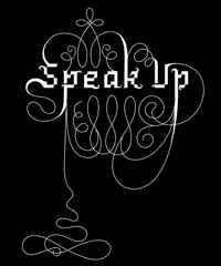
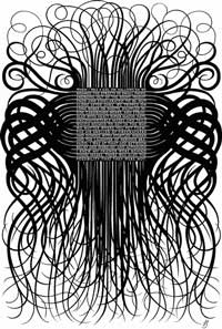
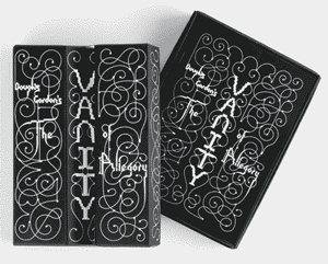
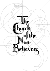
1)Bantjes, M., Poynor, R. and Bantjes, M. (n.d.). Marian Bantjes. 1st ed. 2)Bantjes, M. (n.d.). I wonder. 1st ed. 3)https://www.ted.com/talks/marian_bantjes_intricate_beauty_by_design. (n.d.). [video]. 4)Marian Bantjes. (2017). About - Marian Bantjes. [online] Available at: http://bantjes.com/about/ [Accessed 21 Dec. 2016]. 5)Marian Bantjes. (2017). Church of the Non-Believers - Marian Bantjes. [online] Available at: http://bantjes.com/work/church-of-the-non-believers/ [Accessed 22 Dec. 2016]. 6)Marian Bantjes. (2017). Halloween '05 - -7)Marian Bantjes. [online] Available at: http://bantjes.com/work/halloween-05/[Accessed 21 Dec. 2016]. 8)Marian Bantjes. (2017). I Wonder - Marian -Bantjes. [hard-copy] [online] Available at: http://bantjes.com/work/i-wonder/ [Accessed 21 Dec. 2016]. 9)Marian Bantjes. (2017). Influences Map - -10)Marian Bantjes. [online] Available at: http://bantjes.com/work/influences-map/[Accessed 21 Dec. 2016]. 11)Marian Bantjes. (2017). Pretty Pictures - 13)Marian Bantjes. [hard-copy] Available at: http://bantjes.com/work/pretty-pictures/ [Accessed 18 Dec. 2016]. 14)Marian Bantjes. (2017). Saks Want It! - Marian Bantjes. [online] Available at: http://bantjes.com/work/saks-want-it/ [Accessed 21 Dec. 2016]. 14)Marian Bantjes. (2017). Seduction - Marian Bantjes. [online] Available at: http://bantjes.com/work/seduction/ [Accessed 7 Jan. 2017]. 15)Marian Bantjes. (2017). Speak Up T-Shirt - 16)Marian Bantjes. [online] Available at: http://bantjes.com/work/speak-up-t-shirt/ [Accessed 7 Jan. 2017]. 17)Marian Bantjes. (2017). The Vanity of Allegory - Marian Bantjes. [online] Available at: http://bantjes.com/work/the-vanity-of-allegory/ [Accessed 7 Jan. 2017]. 18)Marian Bantjes. (2017). Valentines 2005 - Marian Bantjes. [online] Available at: http://bantjes.com/work/valentines-2005/ [Accessed 7 Jan. 2017].